Tuesday 29 October 2013

Mood Board


Analysing my mood board I have created base on urban music magazines.
 I found out most of the urban music magazine covers uses a low angle camera shot on the central image which has the effect of making them appear bolder and as if they have an authority.
In addition medium angle shots are also used on the central images this way the audience can have a glimpse of their costume, body language and facial expression. The use of a medium angle shot gives the central artists a mysterious look.
Most of the central artists on the magazine cover are dressed very urban and street to reflect the genre of the music.
The most of males’ artists on the front cover have tattoos on the body and face to reflect the street style which links with the rap genre in the urban music. The tattoos are almost like part of their image.
Analysing the artists how they are dressed; I found out most of them are wearing gold and silver chains and rings. This reflects to the urban style. Where gold and silver chains and rings are part of the rap style look.
Analysing the artist’s costumes I noticed they wear like leather dressing and griffin printed shirts which reflects to with the rap style look and R&B look in the urban genre.
Most of the artists have an overall image of bold and confident.
Analysing the cover page of these urban music magazines I found out most of the font style of the title block are very bold and uses dark colours and sharp colours like hot pink and red.
Most of the urban music magazine covers have colour schemes which includes the colours white, red, yellow, black and pink.

Thursday 24 October 2013

Focus group


Analysis of focus group

After informing my focus group of my magazine plan they recommended me to have my music magazine targeted to ‘16 years to 24’ years old being as it is suitable, my magazine should cost ‘£3.00’ being said as a feedback my previous price as £1.99 was too ‘cheap’ and the colour scheme should be black and white because it relates to my music genre being said as a feedback my previous colour scheme purple black and white did not ‘match’ or relate with the music genre.


Sunday 20 October 2013

Final Title Block

Final Title Block
https://blogger.googleusercontent.com/img/b/R29vZ2xl/AVvXsEg6bUrzUTJOIdUDvf_spxbhtrdPpNthBAxrOgXnqlzy1BwR2HhRZQjxUr17EVmoiukzDDJB0hSGImwZCvgaI_TkfOX_4O1qBn6bjSpEsYabb0rbOyxB4TeWarPlTTGV8e_EJE3Tq_KE4uI/s400/Picture1.jpg
 I created and designed three title blocks which my target audience voted for the best title block on the poll I created on my blog, ‘Which title block do you prefer?’

From studying the results on my poll results I found out what my target audience thought was the best title block. Title block 1 had the most vote 52%, title block 2 had the second most vote 33% and title block 3 had the least vote 14%.

Studying the results I decided to choose title block 1being as this block has the most votes.

I did a few adjustments on title block 1. I changed the ‘R’s to pink being as it is more feminine and it appeals to my audience. In addition to that I also added a griffin effect on the outline of the letters using Photoshop CS6. The griffin on the title block represents the rough hard and street lifestyle most rappers relate to when raping. This allows the audience to be more engage with the rap side in urban music and makes it easy for the buyers to identify the music genre.


Potential title blocks

Title Block Designs 


Title Block 1


Title Block 2


Title Block 3


Thursday 17 October 2013

Title Block Analysis

Title Block Analysis 


The title of this block is ‘Q’, the letter ‘Q’ is a unique letter which is not commonly used, this tells gives us an impression of the genre of the magazine being more of alternative. Adding to that this tells us this type of magazine is not a mainstream and it is more of a niche magazine.  In addition the title ‘Q’ makes us think question being as in most cases ‘Q’ stands for the question. This could suggest to us that the magazine could contain many interviews were question are asked by fans and answered by artists.

In addition title ‘Q’ quite does not immediately hint to us readers what is the music genre of music magazine. This could imply to us the magazine contains all music genres being as the title does not specific show what is music genre of the magazine.

The title block colour scheme is white and red; where the background of the title block is red and the title font is white. The colour red has been used to contrast with white font to allow the title to stand out. The effect it has on the buyer is that it is grabs the buyer’s attention.


The font style is quite formal, the font is in italic font style this gives us an impression the magazine is for an older generation. The font style is simple, this gives us an impression the magazine is aimed at both genders for females and males.


The title of this block is ‘NME’; the title is a three letter word ‘NME’ which stands for ‘New Musical Express’ which tells the readers already this magazine is a music magazine. The title does not straight way tells us what the type of genre the music magazine is.

Though analysing the use of colour re, black and red looking at these colours makes us think immediately the genre is rock being as the colours red and black are associated with the genre rock.

The title block colour scheme is black, red and white. The colour black is used to outline the title which gives it a bold effect on the title and makes it stand out more.

The font style is very sharp, edgy and bold it is more of a masculine rather than feminine. This suggests the magazine is targeted mostly to males.
‘ New Musical Express’ the word ‘New’ suggest the magazine prints the latest news and the word ‘Express’ suggest the magazine printed out weekly.


The colour scheme suggest to me that the target audience will be males who are quite rebellious  being as black and red are quite strong and tough colours. Adding the target audience’s interests and hobbies are mostly attending rock gigs and listening to rock music. 


 I can tell immediately the genre of this music magazine looking at the title it is rock because of the design of the front which is very rough and has crack lines. This style is very masculine.
The front style and colour scheme tell us the magazine is targeted at rebellious people. The colour r scheme is black and white. The combination of these two colours gives the front a sharp and bold look. The font style is very rough and has white crack lines across the front to the front a crack

I can tell immediately the genre of this music magazine is rock/heavy metal because the title of magazine ‘KERRANG’ is sound played on an electric guitar on a power chord. Electric guitars are mostly played in rock/heavy metal music. This clearly tells us the magazine is a rock magazine.
The title block is very rough and strong which appeal to the target audience – rebellious people.
The colour scheme, black and white is two complementary colours which mirrors the style of the music magazine- very loud and heavy sounds.

The white lights used on the title block almost pronounce the white lights in rock concerts.
Looking the colour scheme, black and white suggest the target audience are people who acts like leaders and rebellious.  As black represent power and authority. Adding to that the exclamation reflect to the genre of the music heavy and loud.


Saturday 5 October 2013

Magazine initials planning -Analysing survey

Magazine initials planning

-Analysing survey

I created a survey base on music magazines on survey monkey as one of my initials planning to help me to plan and created my music magazine. 17 people completed my survey.

 Analysing and calculating the results from question 1, I found out 50% of the 17 people that carried out myself ticked off ‘Drake’, 25% ticked off ‘BeyoncĂ©’, 12.5% ticked off Lady Gaga, and 12.5% ticked off Justin Timberlake.

The chart above shows me having Drake as a central image on an R&B music magazine front page would attract more people.

 In question 2 I asked ‘How often do you think I should publish my music magazine’ out 17 people 52.94% said that I should publish my music magazine weekly and 47.06% said monthly.
 In conclusion this shows us and tells me that more people would prefer to purchase and read my music magazine weekly.

Calculating the results from question 3 I found out that out of 17 people that completed my survey 88.2% said that they would be interested in promotional offers and freebies. This is big percentage. In conclusion this tells me promotional offers and freebies are huge influences people purchasing music magazines.

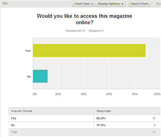
Calculating the results from question 4 I found out that out of the 17 people that completed my survey 88.24% said that they would like to access my music magazine online. This is a big percentage. The other 11.76% ticked no. In conclusion this tells me more people would want an online edition of my magazine. 

The results above shows me people would be interested to read articles on artists and music awards.

17 people carried out my survey, in question 5 76.47% of them said they want articles on artist and the other percentage said they would like to read articles on music awards.

Question 6 was ‘What influences you to buy a music magazine?’ 15 out 17 people said the central image on the front page influences them to buy a music magazine and 2 out 17 people the puffs influences them to buy a music magazine.  The results showed above clearly illustrates to me that the central image on the front page of a magazine has huge influence on the buyers.

Analysing and calculating the results from question 7, 64.71% of the people that carried out my survey said they will purchase an R&B music magazine from £1.00 to £1.99. The other 35.29% said they would purchase an R&B music magazine from £2.00 to £2.99. The bar chart above tells me that most people will purchase an R&B music magazine from £1.00 to £1.99.