Tuesday, 6 May 2014

Wednesday, 29 January 2014


Friday, 24 January 2014
Monday, 23 December 2013
Reflection on feedback
Reflection on feedback
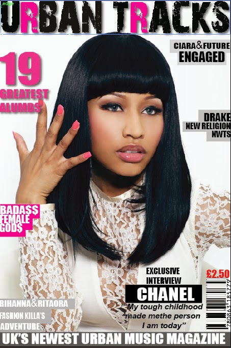
To improve my front cover page I will make my anchoarge text big so it catches my readers’ attention. Make sure my puffs are not too close to the edge otherwise it willl look cut off. Lastly I will minise the amount of blank spaces.
To improve my contents page I will make my title gritty similar to my front cover title to continue the house style and include more pictures with page number attached on and lastly check my grammar.
Friday, 20 December 2013


Monday, 16 December 2013


Thursday, 5 December 2013
Sunday, 1 December 2013
Photographs


Saturday, 30 November 2013

Tuesday, 26 November 2013


Friday, 22 November 2013

Monday, 11 November 2013
Planning artist
Planning artist
 Kayla Carter will be my artist on my mock up magazine.
Kayla Carter known as Kayla born January 6 1990 is an UK unsigned singer and songwriter artist. Born and raised in East London, Stratford. Layla has performed in several singing competition as a child and teenager with her previous girl band group ‘Dreams’. Kayla currently is a solo artist has her own YouTube Channel called Kayla’s Music where she covers well know well known urban music- r&b and rap by famous artists like Drake and Beyoncé. Along her music lifestyle Kayla Carter is studying fashion and music in Cambridge University. Kayla carter mainly focuses on rap music.
I will represent my artist as a bold and confident individual. I will do this dressing my artist very chic but edgy the same time. This way sophisticated look relates with the r&b side and the edgy look relates with the rap side. She will be dressed in a long black jumpsuit. This sophisticated and edgy will emphasises female power and right in the music industry.
I will do this dressing my artist in bold colours that represent authority. I will position my artist in the centre to emphasise she has power; I will also make sure her body language is very bold and confident.
Kayla’s style and look will be very urban but sophisticated and elegant at the same time.
Kayla’s attitude and personality will be presented as very friendly and cheerful on the front cover. This challenges the stereotype of rap music, where most artists’ personality is presented as mysterious.
Where Kayla focuses on rap mainly in urban music, her being the front artist challenges the stereotype of rap music in urban which is very stereotypical- mainly men are known in the rap industry.
Kayla Carter will be my artist on my mock up magazine.
Kayla Carter known as Kayla born January 6 1990 is an UK unsigned singer and songwriter artist. Born and raised in East London, Stratford. Layla has performed in several singing competition as a child and teenager with her previous girl band group ‘Dreams’. Kayla currently is a solo artist has her own YouTube Channel called Kayla’s Music where she covers well know well known urban music- r&b and rap by famous artists like Drake and Beyoncé. Along her music lifestyle Kayla Carter is studying fashion and music in Cambridge University. Kayla carter mainly focuses on rap music.
I will represent my artist as a bold and confident individual. I will do this dressing my artist very chic but edgy the same time. This way sophisticated look relates with the r&b side and the edgy look relates with the rap side. She will be dressed in a long black jumpsuit. This sophisticated and edgy will emphasises female power and right in the music industry.
I will do this dressing my artist in bold colours that represent authority. I will position my artist in the centre to emphasise she has power; I will also make sure her body language is very bold and confident.
Kayla’s style and look will be very urban but sophisticated and elegant at the same time.
Kayla’s attitude and personality will be presented as very friendly and cheerful on the front cover. This challenges the stereotype of rap music, where most artists’ personality is presented as mysterious.
Where Kayla focuses on rap mainly in urban music, her being the front artist challenges the stereotype of rap music in urban which is very stereotypical- mainly men are known in the rap industry.

Tuesday, 29 October 2013
Mood Board
Analysing my mood board I have created base on urban music magazines.
I found out most of the urban music magazine covers uses a low angle camera shot on the central image which has the effect of making them appear bolder and as if they have an authority.
In addition medium angle shots are also used on the central images this way the audience can have a glimpse of their costume, body language and facial expression. The use of a medium angle shot gives the central artists a mysterious look.
Most of the central artists on the magazine cover are dressed very urban and street to reflect the genre of the music.
The most of males’ artists on the front cover have tattoos on the body and face to reflect the street style which links with the rap genre in the urban music. The tattoos are almost like part of their image.
Analysing the artists how they are dressed; I found out most of them are wearing gold and silver chains and rings. This reflects to the urban style. Where gold and silver chains and rings are part of the rap style look.
Analysing the artist’s costumes I noticed they wear like leather dressing and griffin printed shirts which reflects to with the rap style look and R&B look in the urban genre.
Most of the artists have an overall image of bold and confident.
Analysing the cover page of these urban music magazines I found out most of the font style of the title block are very bold and uses dark colours and sharp colours like hot pink and red.
Most of the urban music magazine covers have colour schemes which includes the colours white, red, yellow, black and pink.
Thursday, 24 October 2013
Focus group
Analysis
of focus group
After informing my focus group of
my magazine plan they recommended me to have my music magazine targeted to ‘16
years to 24’ years old being as it is suitable, my magazine should cost ‘£3.00’
being said as a feedback my previous price as £1.99 was too ‘cheap’ and the colour
scheme should be black and white because it relates to my music genre being
said as a feedback my previous colour
scheme purple black and white did not ‘match’ or relate with the music genre.
Monday, 21 October 2013
Sunday, 20 October 2013
Final Title Block

I
created and designed three title blocks which my target audience voted for the
best title block on the poll I created on my blog, ‘Which title block do you prefer?’
From studying the results on my
poll results I found out what my target audience thought was the best title
block. Title block 1 had the most vote 52%, title block 2 had the second most
vote 33% and title block 3 had the least vote 14%.
Studying the results I decided to
choose title block 1being as this block has the most votes.
I did a few adjustments on title
block 1. I changed the ‘R’s to pink being as it is more feminine and it appeals
to my audience. In addition to that I also added a griffin effect on the
outline of the letters using Photoshop CS6. The griffin on the title block
represents the rough hard and street lifestyle most rappers relate to when raping.
This allows the audience to be more engage with the rap side in urban music and
makes it easy for the buyers to identify the music genre.


Thursday, 17 October 2013
Title Block Analysis
Title Block Analysis

The title of this block is ‘Q’, the letter ‘Q’ is a unique
letter which is not commonly used, this tells gives us an impression of the
genre of the magazine being more of alternative. Adding to that this tells us
this type of magazine is not a mainstream and it is more of a niche magazine.
In addition the title ‘Q’ makes us think question being as in most cases
‘Q’ stands for the question. This could suggest to us that the magazine could
contain many interviews were question are asked by fans and answered by artists.
In addition title ‘Q’ quite does not immediately hint to us
readers what is the music genre of music magazine. This could imply to us the
magazine contains all music genres being as the title does not specific show
what is music genre of the magazine.
The title block colour scheme is white and red; where the
background of the title block is red and the title font is white. The colour
red has been used to contrast with white font to allow the title to stand out.
The effect it has on the buyer is that it is grabs the buyer’s attention.
The font style is quite formal, the font is in italic font
style this gives us an impression the magazine is for an older generation. The
font style is simple, this gives us an impression the magazine is aimed at both
genders for females and males.

The title of this block is ‘NME’; the title is a three
letter word ‘NME’ which stands for ‘New Musical Express’ which tells the readers
already this magazine is a music magazine. The title does not straight way
tells us what the type of genre the music magazine is.
Though analysing the use of colour re, black and red looking
at these colours makes us think immediately the genre is rock being as the
colours red and black are associated with the genre rock.
The title block colour scheme is black, red and white. The colour
black is used to outline the title which gives it a bold effect on the title
and makes it stand out more.
The font style is very sharp, edgy and bold it is more of a
masculine rather than feminine. This suggests the magazine is targeted mostly
to males.
‘ New Musical Express’ the word ‘New’ suggest the magazine
prints the latest news and the word ‘Express’ suggest the magazine printed out
weekly.

I can
tell immediately the genre of this music magazine looking at the title it is
rock because of the design of the front which is very rough and has crack
lines. This style is very masculine.
I can tell immediately the genre of this music magazine is
rock/heavy metal because the title of magazine ‘KERRANG’ is sound played on an
electric guitar on a power chord. Electric guitars are mostly played in
rock/heavy metal music. This clearly tells us the magazine is a rock magazine.
The white lights used on the title block almost pronounce
the white lights in rock concerts.
Saturday, 5 October 2013
Magazine initials planning -Analysing survey
Magazine
initials planning
-Analysing
survey
I created a survey base on music magazines on survey monkey as one of my initials planning to help me to plan and created my music magazine. 17 people completed my survey.

Analysing and calculating the results from question 1, I
found out 50% of the 17 people that carried out myself ticked off ‘Drake’, 25%
ticked off ‘Beyoncé’, 12.5% ticked off Lady Gaga, and 12.5% ticked off Justin
Timberlake.
The chart above shows me having Drake as a central image on an
R&B music magazine front page would attract more people.

In question 2 I
asked ‘How often do you think I should publish my music magazine’ out 17 people
52.94% said that I should publish my music magazine weekly and 47.06% said
monthly.
In
conclusion this shows us and tells me that more people would prefer to purchase
and read my music magazine weekly.

Calculating the
results from question 3 I found out that out of 17 people that completed my
survey 88.2% said that they would be interested in promotional offers and
freebies. This is big percentage. In conclusion this tells me promotional
offers and freebies are huge influences people purchasing music magazines.

Calculating the results from question 4 I found out that out of
the 17 people that completed my survey 88.24% said that they would like to
access my music magazine online. This is a big percentage. The other 11.76%
ticked no. In conclusion this tells me more people would want an online edition
of my magazine.

The results above
shows me people would be interested to read articles on artists and music
awards.
17 people carried out my survey, in question 5 76.47% of them said
they want articles on artist and the other percentage said they would like to
read articles on music awards.

Question 6 was
‘What influences you to buy a music magazine?’ 15 out 17 people said the
central image on the front page influences them to buy a music magazine and 2
out 17 people the puffs influences them to buy a music magazine. The
results showed above clearly illustrates to me that the central image on the
front page of a magazine has huge influence on the buyers.

Analysing and
calculating the results from question 7, 64.71% of the people that carried out
my survey said they will purchase an R&B music magazine from £1.00 to
£1.99. The other 35.29% said they would purchase an R&B music magazine from
£2.00 to £2.99. The bar chart above tells me that most people will purchase an
R&B music magazine from £1.00 to £1.99.
Friday, 4 October 2013
Subscribe to:
Posts (Atom)